Monday, February 27, 2017

Some Button Types

1. Raised Button
Typically rectangular button that lifts (the shading indicates that it is possible to click). Raised buttons add dimension to mostly flat layouts. They emphasize functions on busy or wide spaces.


2. Flat Button
Flat buttons do not lift, but fill with color on press. The major benefit of flat buttons is pretty simple — they minimize distraction from content.


3. Toggle Button
A toggle button allows the user to change a setting between two (or more) states.


4. Ghost Button
Ghost buttons are those transparent and empty buttons that have a basic shape form, such as a rectangular. They are generally bordered by a very thin line, while the internal section consists of plain text.


Button States

1. Normal
Main rule for this state—button should look like a button in a normal state (customer should understand it's clickable).

2. Focused
Offering a good visual feedback to users that they’re hovering over a button is good practice.

3. Pressed
Happens on click. Changing style, animation.

4. Inactive.
There are two possibilities — either hide a button or show it in disabled state.


Source: uxplanet

Friday, February 24, 2017

How to indicate there's some info available on hover/click?

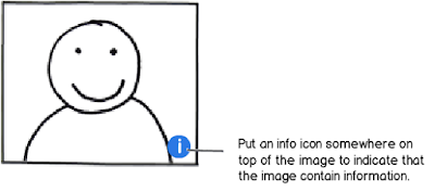
1. "Info" icon in the corner:


May be on hover or on click. 

2. Mobile: remember there's no hover. 


3. Highlighting with styling. Example -- dotted underline. Info may appear on hover or on click:


4. 4. Mouse pointer changing on hover:


Then info is displayed on click.

Should a button become lighter or darker on hover?

The key is not really the colour, it is the contrast.

Let say that you have the more common scenario of dark text and no other part of the design changes on hover and it's the background only, then when you hover, the button should be given a highlight. You're trying to focus on an item - to examine it and therefore it makes sense to brighten it up as if giving it more light to see by. Appearing backlit or frontlit makes no difference.

By comparison, look at the inverse scenario, where you have light text, the same rule of thumb would say that in order to increase relative contrast between figure and ground, the background should darken, to increase the relative contrast.